
PSYCHOLOGICAL HORROR/THRILLER
IMMORTALS
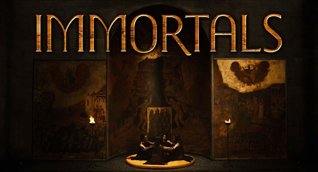
With Immortals, the title lives in the space of the Temple of the Oracles. Originally, they got introduced to the oracles in a long, slow pan as they’re walking on a red circular pad. The type was meant to be a massive, somewhat menacing three-dimensional object in this room. They chose a heavy, compressed typeface that they modified to be even heavier and more compressed. Tarsem’s brilliant production designer Tom Foden suggested that they give it the gold brick texture of the jail of the Titans that appears early in the movie.
They were at the point of approval when Tarsem decided to reshoot the opening with a completely different set! The temple had been an Eastern design of black and white tiles, and then it became a much more medieval space — a dark cathedral with golden accents. To match this, Tarsem wanted much lighter type.
They built the final logotype on garda titling 2 by Mário Feliciano. I kept the I, L, and S unchanged, and lengthened the tail of the R. I rebuilt the M, O, and A entirely. The curve of the M parallels the curve of the temple alcove, which is also where the O and the top of the A get their shape. They added a bit of a granite texture, some gold leaf, and a tasteful light swipe. For the end credits they just used Garda Titling II straight out of the can — with judicious letterspacing and a gold effect. As a bonus, they got to create a condensed version of the logotype for the French Canadian release, so that we could fit an extra three letters into the cathedral space without losing any height.
EVIL DEAD
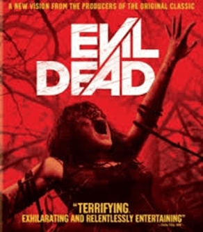
The original concept was really simple, to pay tribute to the gory aspects of the Evil Dead films. We knew it should be simple and overwhelming, and we were sure it had to be very analog as opposed to digital.
After thinking about many approaches with my creative partners, Javi (Javier Cruzado) and Chico (Chico Jofilsan), we chose a really simple idea of background and figure, where the blood would be the graphic element that discovers the shapes and forms. We wanted something raw, simple, and obviously, as gory as possible.
A bloodshot title card and the hammering notes of a dread chorale close out a weekend getaway quite literally from Hell.
Before the audience is allowed to escape this cabin in the woods though, Aparato’s gruesome title sequence for Evil Dead — an “homage to gore,” as Director Fede Alvarez calls it — forces them to relive every murderous detail of the proceedings in a ghastly instant replay of sorts. Globules of blood hover in the murk, like the embers of a dying fire; a rivulet of red slinks down a decaying staircase, dripping into a waiting pool of carnage. Soon, the vital fluid begins splattering the walls and floors, the ferocity of Roque Baños’ score increasing to match the foul play. Limbs are hacked, nails pierce muscle and splinter wood, and a smoking chainsaw chews through flesh and bone in an ever more violent summary of Deadite deaths and self-inflicted savagery. Demonic scripture flashes, blood rains, and the screen is consumed by flame.
BLACKSTONE
- Blackstone is an unmuted exploration of First Nations’ power and politics. This raw, intense, and authentic drama tells the story of the fictional Blackstone First Nation, suffering disintegration by its own hand — the result of the corruption of its chief and council. From within the community, a new generation of leaders rise up and fight to create lasting and substantial change.
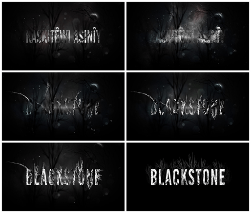
Ron E. Scott, the creator of Blackstone came to us looking for an opener that matched the raw grit of the show. We wanted to create something that would have enough detail in it so that something new would reveal itself each time you watched it.
SMOKIN’ ACES
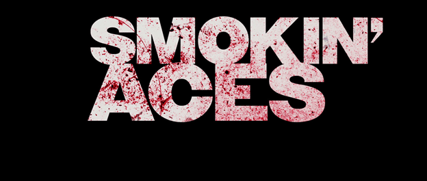
High-contrast colors and a soulful beat instantly transport the viewer back to films of the ’60s and ’70s to revisit the story they just experienced in this main-on-end title sequence. Hep assassins brandish guns and shoot pool, a cop takes a rending shot to the gut, and a femme fatale calmly looks down the sights of her iron: still images captured as if with a rostrum camera.
Taking inspiration from Butch Cassidy and the Sundance Kid and a handful of spaghetti Westerns, VooDooDog pulls the viewer into the debaucherous penthouse suites and grimy basement bars that make up the world of Smokin’ Aces
The texture and effect in the font really impresses me hence I would like to edit my movie titles in this way
 ADINA'S BLOG
Leave a comment